Operam Creative Studio
Joining Operam ( the fastest growing digital first agency in Hollywood ) as ECD to build "Agency 2.0" was another very courageous endeavor. The first leg of the journey was to build a creative maker studio and then navigate how a data first analytics firm expands into a creative agency and then learns how to speak about itself.
Operam Branding
The next thing we tasked ourselves with was Operam's corporate identity. Operam was exploding with growth but wanted to fly under the radar. After sitting down with the founders it was determined that they wanted to remain behind a shroud of mystery but once behind that shroud, to convey Operm's explosive dynamic vision, intelligence, and creativity.
The design we arrived on was sleek, austere and modern for outward facing materials, while interior communications and expression of the brand was full color with dynamic movement.
Operam Logo
The Operam Logo became a vessel that didn’t hold to one particular color but could be all colors, patterns and textures. This reflected the companies ability to reflect each clients needs and goals while holding Operam own individual identity and form.
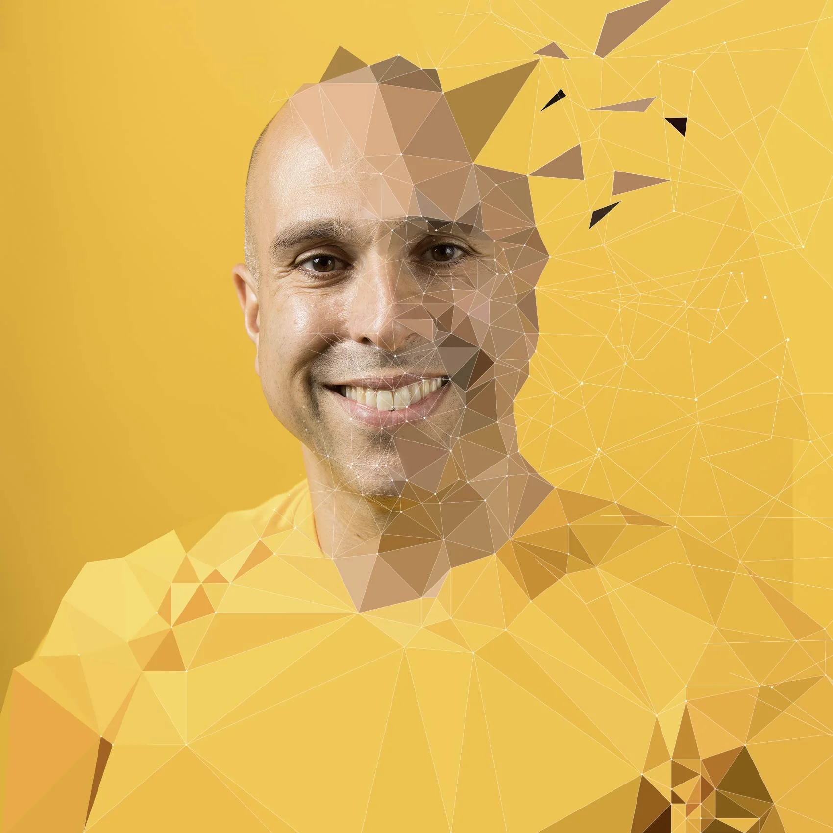
Part Algorithm, Part Humanity.
With the company portraits we expressed the same dynamic qualities in our teams while at the same time conveying that we were a data driven company. The creative team and I developed a low poly illustration process based on photography that allowed us to build each image quickly while also giving each team member their own signature design.


